Min Pension – Onboarding Seniors to "Uttagsplaneraren"
- Client: Min Pension
- Year: 2021
- Service: UX Research, Concept & Visual Design
- My role: Researcher & Designer

Summary
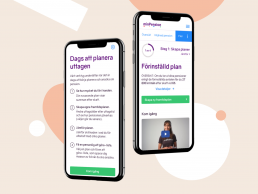
Min Pension noticed very few users used their feature for planning pension withdrawals. I was tasked to explore how they could attract and engage more users to the feature. We used a hypothesis driven and collaborative approach, prioritizing 3 hypothesis to test. The design output was a scaled down onboarding flow, a decluttered starting view and a stepper instead of a dashboard, presets instead of prompting users to start from scratch and copy improvements.
- The amount of text was a problem. The onboarding modal had a lot of detailed instructions, but there was no guided interaction if the user decided to skip (which is the most common use case).
- Customer Support spent a lot of time guiding new users in the tool, and some refrained from telling users about it "if they felt the person wouldn't understand".
- Very, very few of the users actually made it to the end and activated a pension plan, since few understood they had options to choose from.
